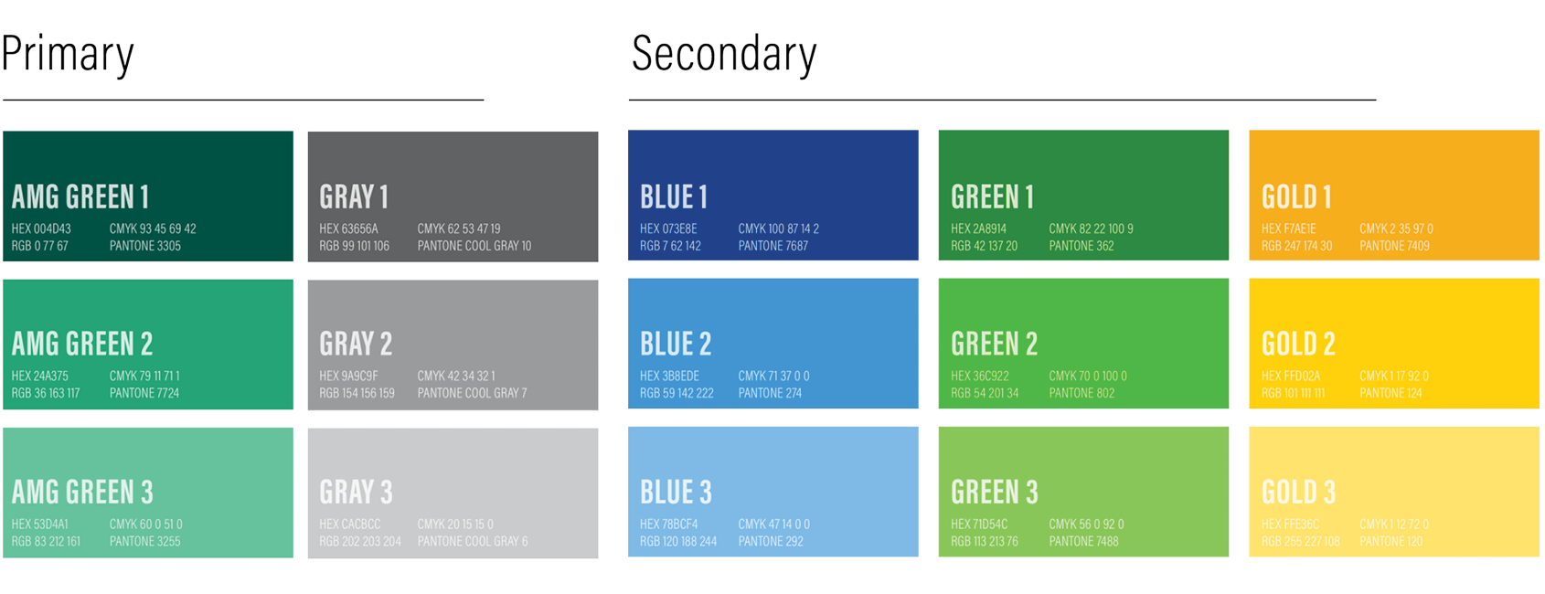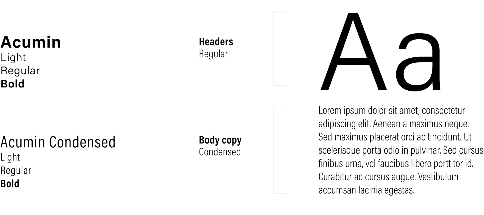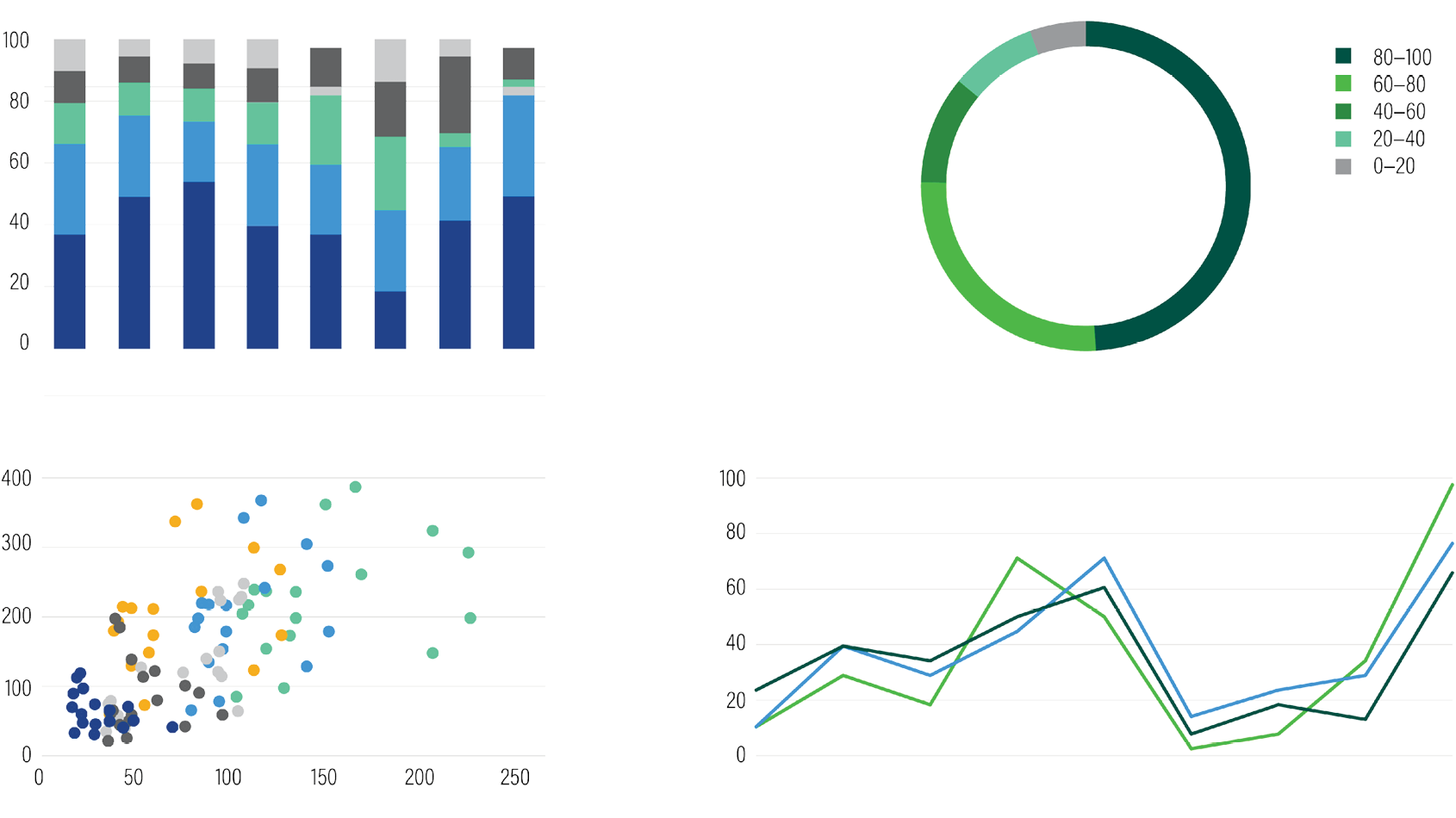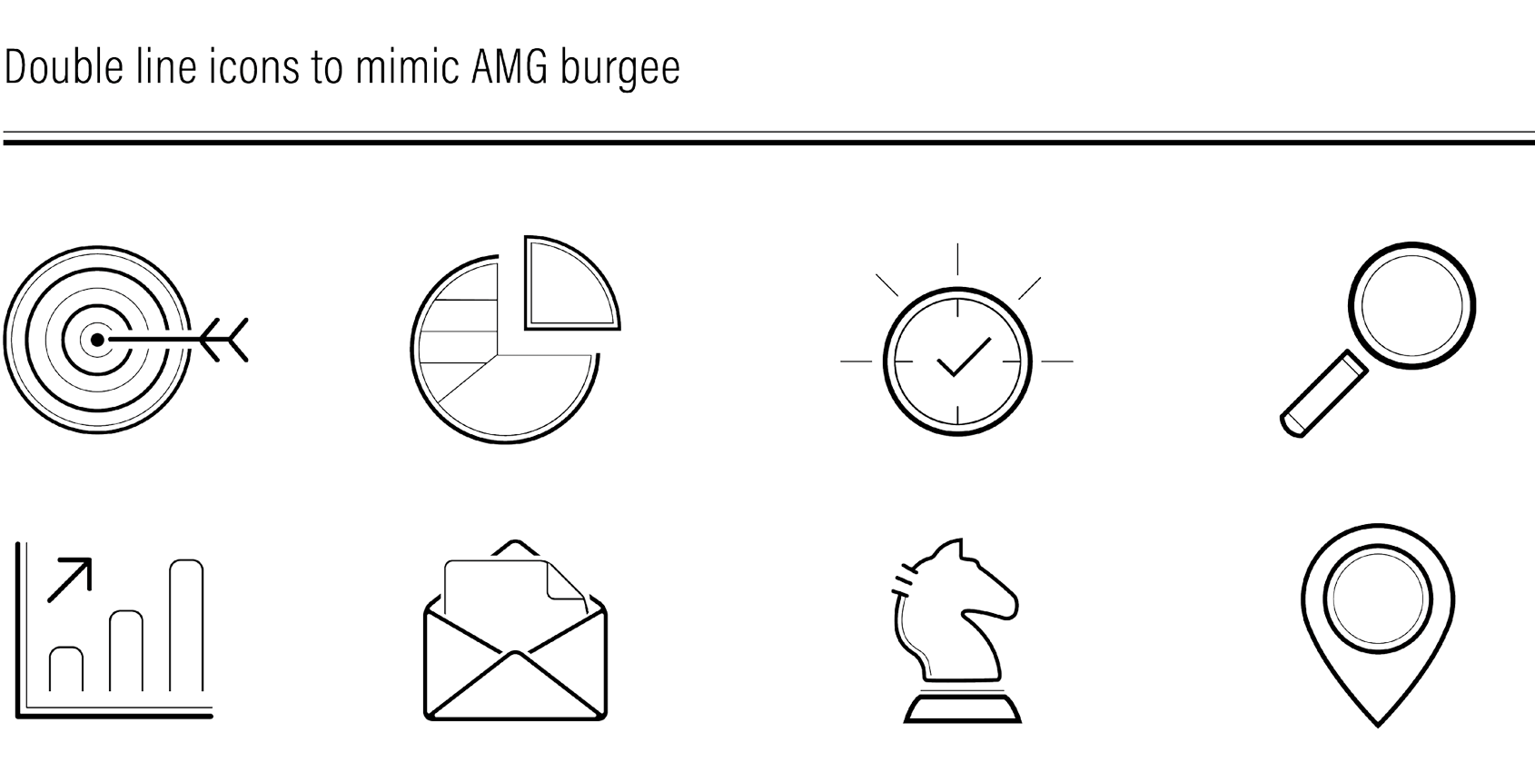
Overview: In conjunction with the refreshed design of the AMG Funds website we were asked to update the visual identity. They wanted the logo to stay the same, but asked us to update the visual language to evoke the feel of the AMG burgee and create a brand toolkit.
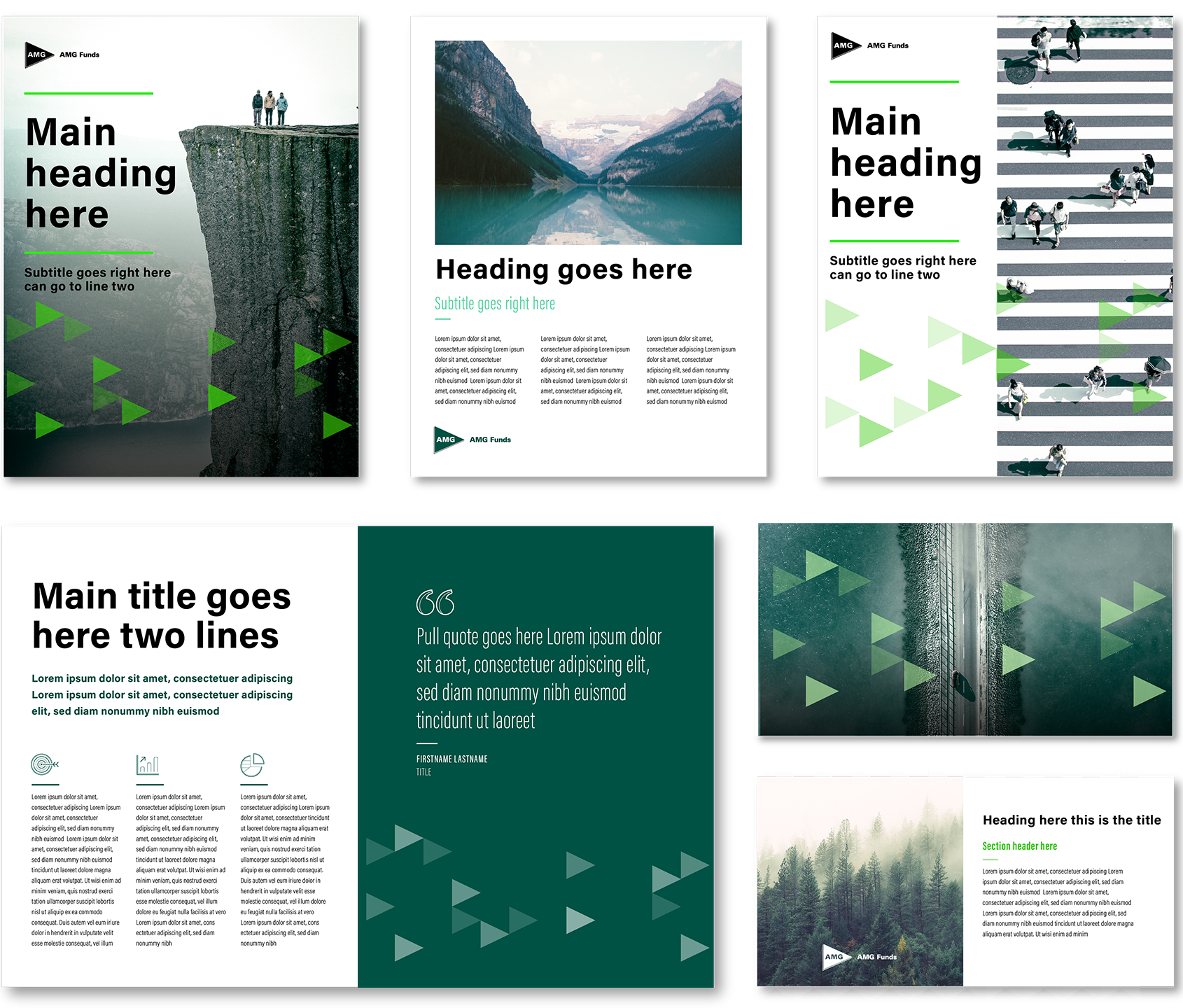
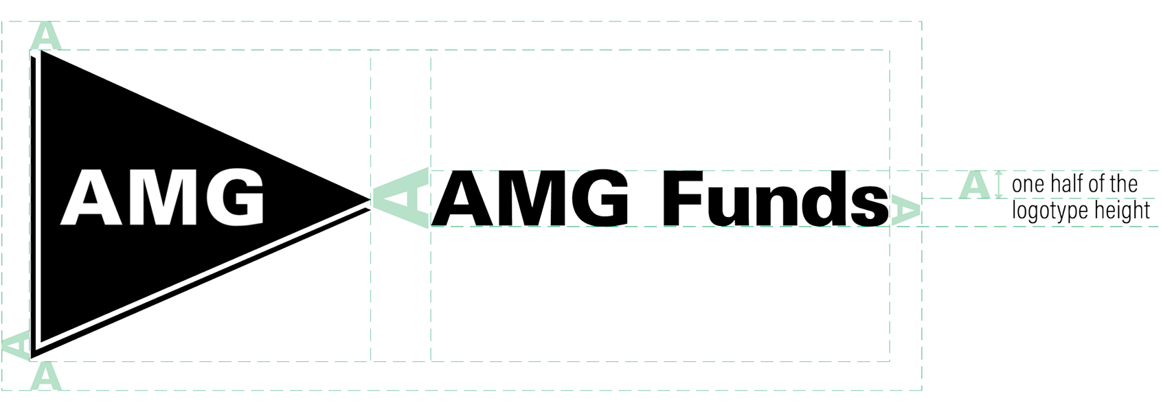
The current VI was outdated and needed more unity across the design elements. We decided to break apart the existing logo and leverage its individual elements through the VI. Using the triangle as the primary motif and the double lines to mimic the burgee, we created a series of assets to augment the logo.
The final deliverables included typography guidelines, a new iconography set, updated color palette, chart examples, and a variety of templates that could be adjusted for multiple assets.
My role: I was the creative lead on this project, providing conceptual thinking and visual explorations. I collaborated with my fellow in-house creative team members across various disciplines to bring this project to life.